Rebranding and positioning of Australia’s show piece public school

The rebranding of NSW’s showpiece Public School.

Tags: Brochure Design / Corporate Document Design / corporate identity / Editorial Design / Environmental Graphics / Identity / Logo Design / Outdoor Advertising / Publications / Rebranding / Signage / social media / Visual Brand Guidelines
CHALLENGES

As a $97.4 million dollar test case redevelopment Parramatta Public School found that their visual brand identity was not befitting a brand-new state of the art learning facility.

Tonic Connective were tasked with overhauling the school’s tired visual branding to give it a contemporary feel whilst maintain a degree of heritage with the first nations people from the Parramatta region.

The school’s catchment area is multi-cultural so developing the correct brand tone of voice was also critical to the project.

STRATEGIC INSIGHT

Parramatta Public School exists to provide quality education and a safe environment for children from the local community and from all backgrounds to flourish.

The school’s staff work together as a team, in the same direction towards the same goals. There’s a supportive culture present, which gets the best out of everyone. The school actively provokes new and different ways of thinking and doing things and strive to stimulate thought and challenge and push to make learning happen.

SOLUTION

Stunning new corporate identity and a detailed brand guidelines book was crafted that not only set in stone rules for logo, font, colour and image usage but also explored a detailed tone of voice guide along with brand and core values.

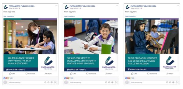
In addition, pull up banners, social media templates and website hero banners were also designed along with an impressive fold out style school overview document.

Parramatta Public School now has a visual brand identity that it can be proud of for years to come and helps it cement its rightful place at the forefront of NSW Public Schools.


Public Schools.